A Close Look at Dawn
When it comes to starting your online store on Shopify, one of the most important decisions you’ll make is choosing the right theme for your brand. Luckily, Shopify offers 13 free design themes, making it easy for small business owners and newcomers to dive in without spending extra money on premium themes. These free options include Dawn, Publisher, Refresh, Colorblock, Taste, Crave, and more—all perfectly suited for businesses with just a few products or those getting started in the world of e-commerce.
Today, I’m going to focus on Dawn, one of the most popular free themes available on Shopify.
Why Dawn?
If you’re new to Shopify or running a small business, this theme could be the perfect starting point. It’s designed to be flexible, minimalist, and easy to use, which makes it an excellent choice for those who want to focus on getting their products in front of customers without spending too much time customizing their store.
However, it’s essential to understand that the default structure of any theme, including Dawn, will influence the overall look of your store. A theme like Dawn encourages a minimalist and simple aesthetic, but remember, the final look of your store is not just about the theme’s default settings. It's more about how you utilize the theme.
Yes, Dawn can create a clean, minimal design, but if you prefer something bold, you can still achieve that within this theme’s framework. Even with some of the limitations that come with free themes like Dawn, you can push the boundaries to create a store that feels unique and far from basic.
Customization and Limitations
As a free theme, Dawn does come with customization limitations, but it’s important to note that even paid themes have their own restrictions. The key is to work within these boundaries and use the tools you have—whether it’s coding or no-code options—to achieve the desired look.
Through my blog, I’ll dive into which visual outcomes can be created with code, and which can be achieved without coding. This will help you understand how to get the most out of Dawn and other themes. For instance, you can customize sections, change fonts, or adjust color schemes without touching any code. But for more advanced customizations—like adding unique product filters or changing certain design elements—you may need some coding or hire a developer.
Thumbnails vs. Thumbnail Carousel
One feature that stands out in Dawn is the product image grid, offering multiple ways to display product images depending on your layout:
-
Desktop Layout: Choose between stacked, 2 columns, thumbnails, and thumbnail carousel.
-
Mobile Layout: Options include 2 columns, show thumbnails, and hide thumbnails.

Let’s break down two of the most commonly used display methods—Thumbnails and Thumbnail Carousel.
Thumbnails
In this layout, all product images appear below the main image in a static format. Customers can quickly see multiple angles or variations of a product, making it easier for them to choose which view to explore in detail. This method is ideal for stores with a limited number of product images, as it provides immediate access to all visuals at once.
The best practice is to choose between the two options based on the number of product images. Five thumbnails fit neatly within the width of the main product image, maintaining a balanced and clean look. If you have more than five product images, I recommend using the thumbnail carousel, as stacking the thumbnails can clutter the page.
Thumbnail Carousel
The thumbnail carousel displays product images in a horizontal scroll format, with arrows or swipe functionality to navigate through the images. This saves space on the product page while still offering multiple product views, keeping the layout clean and uncluttered. It’s a great option if you have a larger number of product images but want to maintain a streamlined look.

Extra Tip
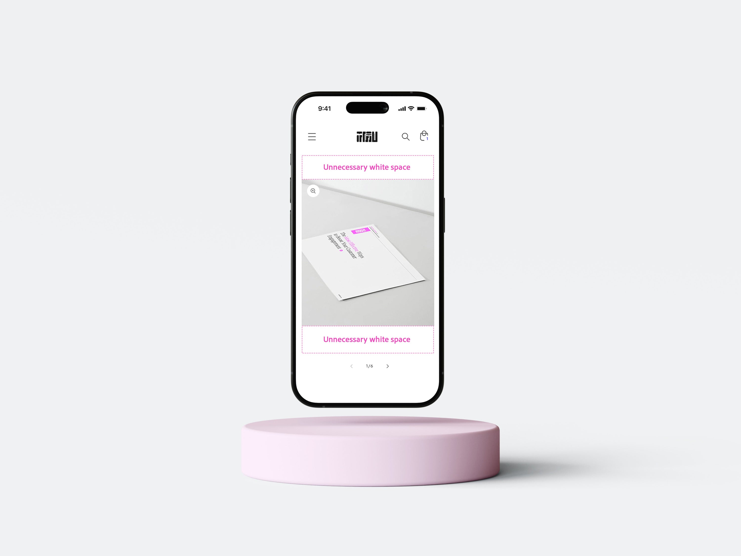
When designing for mobile layouts, avoid using the 2-column display for product pages. While the 2-column grid works well on collection pages (where multiple products are listed), individual product pages benefit from showing a larger main image. In the screenshot above, you can see unnecessary white space. Choose 'Media Fit Fill' instead of 'Original. This allows customers to see the details of your products more clearly, enhancing their shopping experience.

🌟 Feel free to leave a comment if you have tips to share about the Dawn theme or if you have any questions. Let’s learn together.